-
An Architect’s Angle
In News onOnce the work goes out of my studio, it finds new contexts and meanings
in viewers’ minds. It’s fascinating to hear what they see. Last March, I
enjoyed an architect, Saurabh Vaidya’s blog post that showed the work
through his rich, investigative mind. He just posted his second entry on
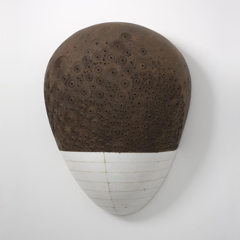
the work. Here are his 1st and the 2nd entry posted back to back:I came across works by two very interesting artists last week,
Nicolas Moulin who envisages ruins of mega monolithic concrete
blocks in a deserted landscape while the other being Hiroyuki Hamada
who designs comparatively small, vaguely futurist looking monoliths.
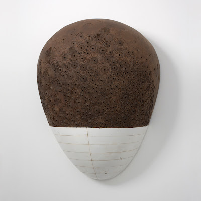


(Some of the many Hiroyuki’s tablets that could easily come to be a parts of totem pole
of a dystopian space age civilization, whose technological advancement has come at
the price of erosion of memory of history and language…where technology is god.
Images sourced from: http://acidolatte.blogspot.com/2010/02/hiroyuki-hamada.html?zx=883872d53fad4dd5)
Hiroyuki’s artifacts that seem to draw semantic nourishment from manga,
minimalism, space debris, Japanese Zen, Buddhism, God particles,
Shivalingam, crustaceans, Mars and brush by closely to Nicolas’s Béton
Brut work that sends roots to Normandy Bunkers, Corbusier, Oplismeno
skirodema, Berlin Wall, Moai, Rosetta stone, Noah’s Arc etc according
to me are not thriving on but are just the opposite. They are soil samples
of the very ground that anchors the tree of Being, from where all these
references germinate.


(Images of Nicolas Moulin’s collages sourced from Vulgare one can also find an online
blog recording by the artist and Amanda Crawley Jackson called Beton brut)
The ability of both these artist to have art works that spread roots
through history and simultaneously come across as being so basic
that it forms a part of Lebenswelt, the very ground of universality
which anchors the roots of metaphysics, to be understood in equal
ways by every member of the human race is according to me the
true essence of their work.
Scale, texture and form, that is all to it, as wise old university
stalwarts would put it, which according to me has more truth to it
than the combined cacophony that we seem to have inherited from
the circus that was post modernism and these two artists working
independently in different circles and continents seem to echo just
that. The simplicity of works is refreshing and it just looks very
very sexy.Lebenswelt appeared at Urban Floop on Sundy, March 28, 2010
Here is his second post:
During my early days in architecture all of us during a brief phase
had taken to worshipping Tadao Ando, which secretly we still do in
some obscure corner of naivety unpolluted by the realisation that
it cannot be that simple, life is far more complicated, filled with
contradictions that need to be represented in our spaces, objects,
skews and corners. Ando had been popular for quite sometime
then but it was during my first year in Architecture that he built
Church of the Light a building that worshipped space, made
concrete an inch more beautiful than what the modernist had left it
as and we drooled.
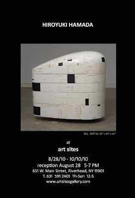
It is this rich simplicity that draws me to Hiroyuki’s work of which I
have written before. Hiroyuki will be exhibiting three new pieces in
his next show at Art Sites, a gallery in Riverhead, NY. If you are
the lucky few around do visit…I personally would like to see the
scale of these objects…and if they open up like loosely held 3d
jigsaw puzzles, or do they crack like egg shells, are they hollow
or filled with a heavy fluid, is there a temperature difference in the
blacks and whites, browns and greys…I guess I will definitely be
banned from entering the gallery or his workshop!
I hope the art work sells and and pray definitely not to clients who
would use it as bourgeoisie conversational props with their boring
guests in plush living rooms with matching minimal aesthetics.Hiroyuki appeared at Urban Floop on Saturday, August 14, 2010
-
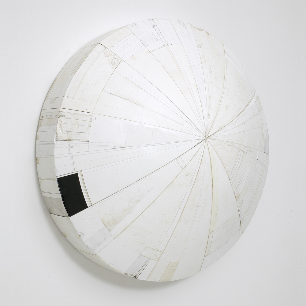
New piece “#56” added to the site
In News onI got the idea for #56 a long while ago. It must have been a little after the year
2000 or so. The image kept coming up in my sketch books repeatedly but I didn’t
start working on it till 2005. Initially, I imagined it to be a simple, but
confrontational piece with a clean, sort of lofty presence like that of #37.
#37
But for the past few years, I’ve been really craving to see a bit more emotional,
rough, and dynamic dimension in the work. And here, I’m not talking about the
basic nature of the work that determines what the essence of it is, but I’m talking
more about the window of how the work can be: Sort of like playing the same song
differently perhaps. It must be that there is some sort of expressionistic streak in
me and perhaps that’s guiding the work to go that way right now.I keep finding out that being 42 years old with a wife and two small boys (well two
dogs too) is nothing I have expected. Actually, 10 years ago, I had no idea that
this would be the picture I would be in. I just wanted to be with then-my-girl-friend-now-my-wife
and I simply followed her to live with her. I bet my wife knew though… Anyway,
it’s amazing to see life through kids’ eyes, keeping up with their energy, trying to
be patient in a group setting, and just trying to balance the time I spend in the
house and in the studio. It’s very, very challenging, exciting, and I should
say that it’s a life on the edge! I thought growing up as a teenager was tough
but growing up as a parent and husband, I mean just as a man can be a time
with lots of dramas and turmoils.So getting back to talking about #56, I wanted the piece to go through a bit
more, like I’ve been going through. I think I am very comfortable with how
it looks now. And I hope you enjoy it too.Here are a few of the images. You can find the full set (8 views with large view
option) at the main part of the site. At the page, please click on #56 at the bottom
bar to go to the #56 menu page. It does take a bit to load, please be patient. If you
have been to the site lately, you might have to clear the cache of the browser to see
the new addition.
#56, 2005-10, 41 1/2 x 41 1/2 x 7 1/2 inches

#56, 2005-10, 41 1/2 x 41 1/2 x 7 1/2 inches

#56 detail

#56 detail view

#56 detail view

#56 detail
-
Art Aspen 2010
In News onAureus Contemporary is taking #68, #51 and #32 to Art Aspen,
August 5-8. Here is the info from the Aureus site:Join Aureus Contemporary at Aspen’s First Ever Fine Art Fair
for Important Post War and Contemporary Art. Never before has
there been an opportunity for art dealers and collectors to come
together and buy/sell fine art in this chic mountain community.
Limited in size to just 30 select galleries, this intimate,
world-class setting is a fun, manageable and rare art buying
experience. Aureus will be presenting new works by Sara Carter,
Karim Hamid, Hiroyuki Hamada and Yi-Hsin Tzeng.Show Hours:
Thursday, August 5, 5pm – 8pm (Opening Preview Party)
Friday, August 6, 12:30pm – 6pm
Saturday, August 7, 11am – 6pm
Sunday, August 8, 11am – 6pmLocation:
Aspen Ice Garden
233 West Hyman Avenue
Aspen, CO 81611-1752
#68, 2007-09, 41 x 23 x 20 1/2 inches, enamel, oil, plaster, tar and wax

#51, 2005-08, 36 x 21 1/2 x 9 1/2, enamel, oil, plaster, tar and wax

#32, 1998-2001, 38 x 36 x 1.75 inches, enamel, oil, plaster, tar and wax
-
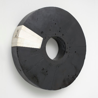
Site Upgrade: July 2010
In News onFive pieces (#47, #48, #42, #43 and #37) got new sets of images with large view
options. 22 images have been added to them. I hope you have a large screen to
view them. To see them, go to the main part of the site and click on the pieces
at the bottom bar. Please be patient it might take a bit to load.
#47, 2002-2005, 37 diameter x 6 inches

#48, 2003-2005, 33 diameter x 8 inches

#42, 35 x 17 1/2 x 6 inches, 2000-2003

#43, 37 1/2 x 24 1/2 x 9 inches, 1999-2003

#37, 36 diameter x 12 inches, 1998-2002
-
An interview with Merve Unsal
In News onRecently, I had an interview with one of the BoltArt.net editors, Merve Unsal.
Unfortunately, BoltArt site is having a server issue right now but Merve has
put up the interview at her site for now: www.merveunsal.comLet’s hope that BoltArt gets back online soon.
2 -
A refreshing perspective: a visual essay in Creatie
In News onAn Amsterdam based magazine Creatie has a visual essay by Mischa Rozema
of PostPanic that makes you look at my work from a refreshing perspective.
While I couldn’t fully get the text part since the magazine is in Dutch, the
pictures tell the story very well. To me the essay focuses on how we are as a
peculiar specie on the planet that can see who we are and tries to shape who
we are. The essay tells our excitements, uncertainties, oddities and triumphs
in the process. It’s always refreshing and enjoyable to see someone coming
up with a solid theme out of my non-referential work. Thank you Mischa.
To see the essay, please go to main part of my site, click PRESS. It should appear in
the list as “A Visual Essay by Mischa Rozema”.Three other artists who appear in the essay are exceptional. Here are some other
works by them which do not appear in the essay. Hope you visit their sites for more.
White Cosmonaut by Jeremy Geddes

The Man Machine Reem B #1, Pal, Barcelone, 2010 by Vincent Fournier

Anas Animatus D by Hyungkoo Lee
-
Site Upgrade, June 2010
In News onFor the past weeks, I’ve been adding extra images to the pieces at the
SCULPTURE section of the site. They can be clicked for large views.
I’m hoping that you will have a better sense of what the work looks like
with the additions. So far #51, #54, #55, #59, #52, #60, #61, #64, #49,
#50, #44, #45 and #46 have been updated. More pieces will follow…
-
Art Chicago 2010 Pictures Added
In News onI’ve just added some photos from Art Chicago to the main part of the site
(please go to PHOTOS and look under Art Chicago April 30-May 3, 2010).
Andreas and Kevin from Aureus Contemporary along with their installation
specialist Christopher Faiss did a maximum job in hanging a great show at
the booth. As I was looking forward to seeing, it was so satisfying that Karim‘s
paintings and my sculptures interacted so nicely. Here are some for you to see.
Please go to the main site for the complete set and the enlarged versions.


-
but does it float
In News onEvery once in a while I check if “but does it float” has a new entry. The site stands
out, among many visually oriented sites, in showing intriguing images lead by
brief sentences. The text often act as a springboard to lift you up where the images
are displayed or they can playfully set the rhythm to the visual composition that
follows. The curators of the site, Folkert Gorter and Atley G. Kasky, know how to
put up great shows tastefully, beautifully and effectively. Here are some examples.
Click to see the full entry at but does it float

Click to see the full entry at but does it float

Click to see the full entry at but does it float
Here is what they did with my work (below). Somehow the vastness of the text at
the beginning takes you to a place where you can let your imagination fly. It’s so
clever and effective.
Click to see the full entry at but does it float
-
Art for People: NYFA’s A & AE
In News onIt’s no surprise that as an artist I believe art is good. Not just paintings or
sculptures but anything that can make me see new possibilities, open my eyes
to new realities and make me feel some sort of awe inspiring flow that’s
bigger than my usual self. And simply put, there are amazing things out there
that make me say “wow, I’m glad to be alive to see that!”. But actually getting
out and trying to help artists to make things is a tricky matter; especially
when it’s done publicly. When I see people debating about it, I feel helpless.
I have no words to say if someone claims that we have more urgent issues
than people having fun listening to music or painting pictures. And how
do you decide what’s good for people and what’s not?That’s why it’s so refreshing and encouraging to see people just going
ahead and doing what they believe by clever ideas and practical solutions.
Last year I had such a moment when I got to know about
the Artists & Audiences Exchange program of New York Foundation for the Arts.
It’s a part of their grant program which basically give away money to selected
applicants. But they tell the selected applicants that the part of their money
will be given only if they make up a public program for the people in NY state.
OK, so when I got the money from NYFA last year, my response was, “Ah,
what? It’s not a free money? I don’t get it. They are not just giving it to me?
What???.”. Well, that was just before I realized the cleverness and significance
of the program. It’s so great to know that there are smart, capable people
looking after arts out there. Thank you NYFA.After thinking about the program for a few months I decided to give a talk at a
local library, Hampton Library, in Bridgehampton, NY. Its building has just
gotten an extensive renovation and the director of the library has been very
positive and welcoming about the idea (my wife used to work there!). So the
talk is going to be on Saturday May 15th 3:00PM. I will be talking about my
sculpture making process with lots of images. It’ll be relaxed, informal and
hopefully fun. Please let the library know if you are interested in attending.
I will see you there if you are around! Contact information for the Hampton Library in BridgehamptonFacebook Page for the Hampton Library in Bridgehampton
Hiroyuki Hamada is a 2009 Artist Fellowship recipient of the New York Foundation for the Arts (NYFA). This presentation is co-sponsored by Artists & Audience Exchange, a NYFA public program.


