-
Coleman Burke Gallery New York
In News onI’m happy that the next show will be in my favorite city: New York City!

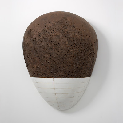
#63 (detail)
It will be at:
Coleman Burke Gallery New York
636 West 28th Street, Ground Floor
between 11th & 12th Avenues
New York, New York 10001
917-677-7825
info@colemanburke.com
http://www.colemanburke.com/newyork/hiroyukihamada.html
December 2, 2010- January 15, 2011
Opening: Thursday, December 2, 6 – 8 PM
 Here is more about the show. It’s been 4 years since the last show in NYC. I’m excited to be back and the gallery space is splendid! I will keep you updated!
 -
Scope Miami 2010
In News onAureus Contemporary is taking #56 and #68 to Scope Miami. If you are in Miami, please stop by to say hi to the friendly Aureus crew!

#56, 2005-10, 41 1/2 x 41 1/2 x 7 1/2 inches, enamel, oil, plaster, tar and wax

#68, 2007 – 09, 41 x 23 x 20 1/2 inches, enamel, oil, plaster, tar and wax
-
Art Sites Show Images Are Up!
In News onImages from the Art Sites show are up at the main part of the site. Here are a few…


For the full photo sets, please click here, and click on PHOTOS at the top bar for Art Sites 2o1o Part 1 to 3. There are 47 images! Or, Hiroyuki Hamada Art at Facebook has an album with same images. They are smaller but load faster. Hope you like the images!
-
cutlog Paris 2010
In News on
#56 and #68 will be at cutlog, a contemporary art fair in Paris (Oct. 20-24) with Aureus Contemporary.
The people at Aureus are all very excited, and I am of course very excited and happy to have my work
introduced to people in Paris!
#56, 2005-10, 41 1/2 x 40 3/4 x 7 1/2 inches

#68, 2007-09, 41 x 23 x 20 1/2 inches
-
The Last Weekend For The Art Sites Show
In News onIt’s been a great few weeks having a show at Art Sites. The show turned out to be super
featuring the latest works as well as the oldest ones. Last week, we have also added nine
of my oldest drawings predating the plaster sculptures. You can see them in the office area.And, we have one more weekend to go! The show will be closing on Sunday the 10th. Here
are a few images from the show. More photos with large view options will be added to the
main part of the site in a few weeks.
#60, 2006-08, 38 x 30 x 16 inches

#39, 43 x 27 1/2 x 6 1/2 inches, 1997- 02

#69, 51 x 22 x 19 inches, 2008-10

#56, 40 3/4 x 41 1/2 x 7 1/2 inches, 2005-10 and #52, 25 diameter x 19 inches, 2002-08

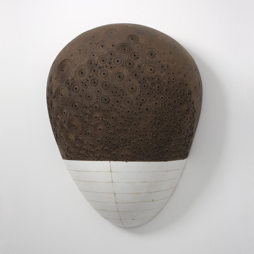
#63, 45 x 40 x 24 inches, 2006-10
Here is how to get to Art Sites: Direction to Art Sites
 Art Sites651 W. Main St.Riverhead, NY 11901631-591-2401hours: th-sun 12-5Please call for additional hours
 -
#69 Images Added
In News onImages of a new piece #69 has been added to the main part of the site. The bottom icon
“#69” at the main page will get you to the #69 page with the various views, the large views
and the additional information. Here are some of the images:
#69 (detail), 2008-10, 51 x 22 x 19 inches

#69 (detail), 2008-10, 51 x 22 x 19 inches

#69 (detail), 2008-10, 51 x 22 x 19 inches

#69, 2008-10, 51 x 22 x 19 inches

#69, 2008-10, 51 x 22 x 19 inches

#69, 2008-10, 51 x 22 x 19 inches

#69 (detail), 2008-10, 51 x 22 x 19 inches
-
Making of #63
In News onMaking process is never straight forward. Any way that works is the right way
for me. With #63, it wasn’t an exception. I’ve gone through lots of trials and
errors and finding and getting lost. And it lasted about 4 years.The first step is usually getting the core idea of the piece. It’s an impression of
the work, or a glimpse of what it can be; it’s the backbone of the piece I can hang
onto during the making process. It might be a quick find with a strong conviction,
or I might get it through numerous sessions of brain storming in my sketchbook.
Either way, it usually ends up as a very rough sketch on a piece of paper.
One of the roughest sketches!
So this is the seed of the piece (above). It’s a crude memo to remember what ticked
me about the piece. Depending on the piece, it can be refined more before I work on
the actual shape. With #63, I did make a few more, just to have rough idea of working
with actual materials.#63 was made in five sections, partly because of the practicality (to make it manageable
in my studio, because of the weight issue basically), and partly, I wanted to incorporate
the dividing lines as part of the piece. Each section’s core was made with foam and wood.
Here is how the core looked at its rough stage (below).

I usually paint the core white to see the shape without the colors of the foam and
wood. The form just has to click into the right place before I go on to the next phase.
Next, the five sections were covered with plaster shells. In order to extend some
dividing lines to the individual sections, plaster was applied in sections.

After going through numerous adjustments, the basic form is decided. Having
the actual shape in front of me helps me to see what has to happen in grasping
the essence of the piece. For instance, compared to the initial plan, I gave more
volume to the top part (upper right in the picture below) and the opposite end also
received a wider top than the lower bottom.

Working with surface is a big part of my process. I like a natural, realistic
appearance that immediately draws me in. Some sculptors might achieve this by
meticulous observations of the materials they use. Or some might chose to focus
on the forms by minimizing the surface variations. With my painting background,
I seem to naturally lean toward making up the whole surface, inch by inch basically.For this piece, I put down 8 to 10 layers of flat white enamel to start. The plaster
surface was sealed prior to being painted.
The clean surface is covered with a mixture of wax, resin and tar. The thick mixture
is spread slowly with a heat gun. This layer allows me to see what the surface is
doing. The imperfections left in the plastering stage and in the painting stage
become active elements for the work.

Marks left by rough application of plaster

Marks left by coarse electric sanding

Rough spots around the edge
#63 brought me into a new territory on a few levels. It’s a first freestanding piece
with a rather complex shape (compared to the other ones I worked on!). I wanted
to fully utilize various views with their own appeals. I wanted to give the front view
a certain visual drama, and if you walk around to the side, you would be greeted by
a different sensation and so on. Also, I wanted to pull the piece together with a
freestyle paint job instead of relying too much on textures or repeating patterns.
Working in this fashion on a 3D surface was a new challenge for me. The surface
would be rough and raw. Simple shapes, lines, subtle tone shifts, contrasts and
etc. can totally energize, and give significance to a blank field. An example of this
approach would be #8 which I finished in 1996:
#8, 39.5 x 32 x 1.75 inches, 1996, collection of Edward Albee
The sensation of getting to that point is rather ecstatic. And with #63, I wanted to
activate the whole 3D shape: Give it a sense of all charged up object with its own
character and history. It was a piece to throw my euphoric desperation of being in
my 40s at (you can read a bit about it here), and dig away and explore.The decisions in the process are made intuitively. By intuitive, I don’t mean to be
random or aimlessly shooting in the dark. I believe our brains can make certain
tasks automatic with accumulated experiences and knowledge. Sometimes in
our daily lives we feel certain things to be right or wrong just by glancing at them.
And we try to figure out what logic went into that feeling. The intuitive step in
my process is a lot like that. It’s not a particular reasoning skill or a theory that
decides the next step but it’s the flash of impulse that strikes when your mind is
empty yet totally alert to every possible step. I value this method since it simply
works in reaching the convincing, realistic presence of the piece, and also it’s a
totally personal and honest step that comes right out of who you are. I also
suspect that the intuitive process would not only encompass our learned skills
and knowledge but it also reflects our instinctive, physiological tendencies.
For instance, people have been asking me if they can touch the piece at shows.
And I gently tell them that the surfaces are fragile. But I really have to admit
that the sense of touch is a real and important component of our experiences.
One interesting aspect of this is that recent studies are revealing an intriguing
mechanism of our lives being influenced by the world of microorganisms.
Our bodies, inside and outside, are surrounded by layers of bacterial colonies
which have been influencing our existence in unknown ways. Who knows
what visual elements trigger our sense of touch which affects the populations
of those invisible layers around us and in turn influences our physiological
beings. The intuitive process must go quite deep on many levels.OK, let’s try to go over the process by showing you the basic steps I took. Once
I got to know the general feel of the surface by browning the entire surface
(putting the thin tar wax layer), I started to divide the surface with fine lines.
This further deepens my understanding of the shape and it also gives the suggestion
of an organized whole with a sense of weight and structural integrity. It is also
effective in emphasizing the gestural quality of the shape or suggestion of the
movement. Natural, effortless application of lines at the right spots is often needed
to ensure an intuitive impression of the surface as opposed to a contrived, manipulative
impression. What’s been effective in achieving this is the following technique:
First, two masking tapes are put side by side real close leaving a very tight gap.

Second, I prepare either thick paint (I usually use mixtures of Oil Bars which
has a good ratio of wax and paint for the purpose) or the above mentioned tar,
wax and resin mixture on a cloth.
After applying the paint. I go over the surface with dry cloth. This will ensure
the right amount of paint in the gap.
The straight line you can see above is the result. You can see how fine it can be
compared to the pencil lines next to it. It can be even sharper if I demonstrated
it on a painted surface. Unfortunately, for this, I used a cardboard. The
transparency of the line can also be adjusted by lifting some paint by putting
masking tape directly over it before it gets dried. The wiping process above is
important since excessive paint would smudge the line during the transparency
adjustment. By using ultra thin flexible tapes, it’s possible to draw any sort of
perfect lines or shapes.The divided surface often guides the intuitive placement of patterns and marks,
which leads to imply tension, balance, gravity and etc. for the piece, just as a
successful figure drawing would imply all of those with underlining bone
structures and flexing muscles.

In addition to the contrasty black patterns, very subtle tone shifts and marks are
painted. Although they seem accidental and spontaneus, they are applied in a
very controlled manner. Following is an example of applying a small smudge:
First, the area to be altered is carefully masked.

Second, paint is applied.

The opacity of the paint is controlled by lifting some paint with the clear tape.
The smooth surface of the tape and the even amount of adhesive is great for
adjusting the strength of the tone consistently.
First layer removed.

Second layer removed.

The third removal achieved the desired tone shift for the area. This method
enables bold, spontaneous strokes in a very controlled fashion. It’s sort of like
a localized, instant print making technique. This tape print method can be
done on much larger areas. It often produces unexpectedly beautiful tone shifts
and textures just as you might in mono prints.Some areas are treated with sanding and waxing resulting in varied smoothness
in addition to the tone shift. You can see an example below (circled area with red).
Following example shows the combination of controlled smoothness and tone
shift resulting in an inlay effect:
An area to have the inlay effect is masked.

The area is sanded with steel wool (very fine water proof sand paper is also
used depending on the area).
You can see the difference in the smoothness by the slight reflection.

Paint is prepared.

The excess paint is taken with steel wool.

Here, unfortunately, the steel wool removed too much paint. I will have to go
in again for another try.
More paint is applied…

Here, the paint is being removed by kneaded eraser. It’s a great tool in the
subtle removal of paint. A regular eraser is also effective depending on the area.
I particularly like an electric eraser for detailed removal of paint (my choice is
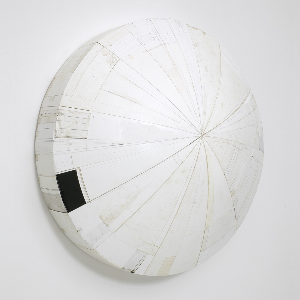
the Sakura Electric Eraser. It’s also a great drawing tool).The inlay technique was also used in making the intricate surface of #62 which I
finished in 2009. Here is the detail of #62:
#62 (detail view), 2007-09, 44 x 23 1/2 inches
One of the keys to the intuitive process is to have a fresh perspective that doesn’t
rule out any possibilities. However, it’s a tough thing to have, especially when you
are struggling to see what should be the next step. It gets particularly tougher
when you are going into new territories. You are learning as you go along. There
will be more trials and errors. The harder you try to think, the more likely you are
to disturb the automatic thinking process that let your visions appear for you…
I think one effective approach to counter this is to tackle the issue from as many
ways as possible. For #63, I set up a computer with a digital camera tethered in
order to see the piece on screen. This enabled me to see the piece with different
lights, color casts, through various filters and etc. in addition to seeing it flipped
or turned. Also this allowed me to simulate certain paint jobs before I actually
worked on the piece. The speed and efficiency is quite useful in making me see
what is going on with the piece. The digital files are also good thinking aids
outside of my studio.
So after a few years of pushing and pulling, digging and burying, the piece is
finally done. One question I get asked often at talks I give is”when do you know
that the piece is done?”. To me, it’s done when the piece has an impression of
simplicity. No matter how complex the piece is, I can grasp the wholeness of
the mass without making the piece fall apart. Every element in the piece has its
function and it is working toward building the solid presence of the piece. It’s a
great feeling to have when the piece is done. Here are some images of the finished
#63. The full picture set with large view options can be found at main part of the site.
Once you go to the site, please click on the bottom icons that say #63. The set is
separated into #63 (page 1) and #63 (page 2).
#63, 2006-10, 45 x 40 x 24 inches

#63 (detail), 2006-10, 45 x 40 x 24 inches

#63 (detail), 2006-10, 45 x 40 x 24 inches

#63, 2006-10, 45 x 40 x 24 inches

#63 (detail), 2006-10, 45 x 40 x 24 inches

#63 (detail), 2006-10, 45 x 40 x 24 inches

#63, 2006-10, 45 x 40 x 24 inches

#63, 2006-10, 45 x 40 x 24 inches

#63 (detail), 2006-10, 45 x 40 x 24 inches

#63 (detail), 2006-10, 45 x 40 x 24 inches

#63 (detail), 2006-10, 45 x 40 x 24 inches

#63, 2006-10, 45 x 40 x 24 inches

#63, 2006-10, 45 x 40 x 24 inches

#63, 2006-10, 45 x 40 x 24 inches

#63 (detail), 2006-10, 45 x 40 x 24 inches
-
An Architect’s Angle
In News onOnce the work goes out of my studio, it finds new contexts and meanings
in viewers’ minds. It’s fascinating to hear what they see. Last March, I
enjoyed an architect, Saurabh Vaidya’s blog post that showed the work
through his rich, investigative mind. He just posted his second entry on
the work. Here are his 1st and the 2nd entry posted back to back:I came across works by two very interesting artists last week,
Nicolas Moulin who envisages ruins of mega monolithic concrete
blocks in a deserted landscape while the other being Hiroyuki Hamada
who designs comparatively small, vaguely futurist looking monoliths.


(Some of the many Hiroyuki’s tablets that could easily come to be a parts of totem pole
of a dystopian space age civilization, whose technological advancement has come at
the price of erosion of memory of history and language…where technology is god.
Images sourced from: http://acidolatte.blogspot.com/2010/02/hiroyuki-hamada.html?zx=883872d53fad4dd5)
Hiroyuki’s artifacts that seem to draw semantic nourishment from manga,
minimalism, space debris, Japanese Zen, Buddhism, God particles,
Shivalingam, crustaceans, Mars and brush by closely to Nicolas’s Béton
Brut work that sends roots to Normandy Bunkers, Corbusier, Oplismeno
skirodema, Berlin Wall, Moai, Rosetta stone, Noah’s Arc etc according
to me are not thriving on but are just the opposite. They are soil samples
of the very ground that anchors the tree of Being, from where all these
references germinate.


(Images of Nicolas Moulin’s collages sourced from Vulgare one can also find an online
blog recording by the artist and Amanda Crawley Jackson called Beton brut)
The ability of both these artist to have art works that spread roots
through history and simultaneously come across as being so basic
that it forms a part of Lebenswelt, the very ground of universality
which anchors the roots of metaphysics, to be understood in equal
ways by every member of the human race is according to me the
true essence of their work.
Scale, texture and form, that is all to it, as wise old university
stalwarts would put it, which according to me has more truth to it
than the combined cacophony that we seem to have inherited from
the circus that was post modernism and these two artists working
independently in different circles and continents seem to echo just
that. The simplicity of works is refreshing and it just looks very
very sexy.Lebenswelt appeared at Urban Floop on Sundy, March 28, 2010
Here is his second post:
During my early days in architecture all of us during a brief phase
had taken to worshipping Tadao Ando, which secretly we still do in
some obscure corner of naivety unpolluted by the realisation that
it cannot be that simple, life is far more complicated, filled with
contradictions that need to be represented in our spaces, objects,
skews and corners. Ando had been popular for quite sometime
then but it was during my first year in Architecture that he built
Church of the Light a building that worshipped space, made
concrete an inch more beautiful than what the modernist had left it
as and we drooled.
It is this rich simplicity that draws me to Hiroyuki’s work of which I
have written before. Hiroyuki will be exhibiting three new pieces in
his next show at Art Sites, a gallery in Riverhead, NY. If you are
the lucky few around do visit…I personally would like to see the
scale of these objects…and if they open up like loosely held 3d
jigsaw puzzles, or do they crack like egg shells, are they hollow
or filled with a heavy fluid, is there a temperature difference in the
blacks and whites, browns and greys…I guess I will definitely be
banned from entering the gallery or his workshop!
I hope the art work sells and and pray definitely not to clients who
would use it as bourgeoisie conversational props with their boring
guests in plush living rooms with matching minimal aesthetics.Hiroyuki appeared at Urban Floop on Saturday, August 14, 2010
-
New piece “#56” added to the site
In News onI got the idea for #56 a long while ago. It must have been a little after the year
2000 or so. The image kept coming up in my sketch books repeatedly but I didn’t
start working on it till 2005. Initially, I imagined it to be a simple, but
confrontational piece with a clean, sort of lofty presence like that of #37.
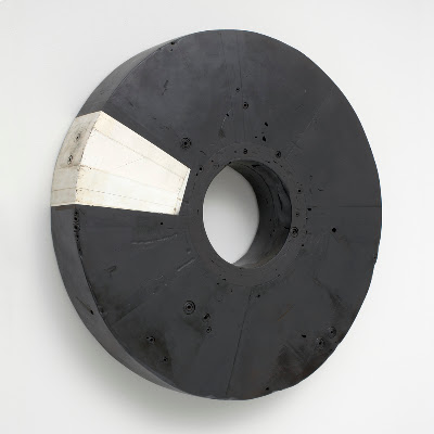
#37
But for the past few years, I’ve been really craving to see a bit more emotional,
rough, and dynamic dimension in the work. And here, I’m not talking about the
basic nature of the work that determines what the essence of it is, but I’m talking
more about the window of how the work can be: Sort of like playing the same song
differently perhaps. It must be that there is some sort of expressionistic streak in
me and perhaps that’s guiding the work to go that way right now.I keep finding out that being 42 years old with a wife and two small boys (well two
dogs too) is nothing I have expected. Actually, 10 years ago, I had no idea that
this would be the picture I would be in. I just wanted to be with then-my-girl-friend-now-my-wife
and I simply followed her to live with her. I bet my wife knew though… Anyway,
it’s amazing to see life through kids’ eyes, keeping up with their energy, trying to
be patient in a group setting, and just trying to balance the time I spend in the
house and in the studio. It’s very, very challenging, exciting, and I should
say that it’s a life on the edge! I thought growing up as a teenager was tough
but growing up as a parent and husband, I mean just as a man can be a time
with lots of dramas and turmoils.So getting back to talking about #56, I wanted the piece to go through a bit
more, like I’ve been going through. I think I am very comfortable with how
it looks now. And I hope you enjoy it too.Here are a few of the images. You can find the full set (8 views with large view
option) at the main part of the site. At the page, please click on #56 at the bottom
bar to go to the #56 menu page. It does take a bit to load, please be patient. If you
have been to the site lately, you might have to clear the cache of the browser to see
the new addition.
#56, 2005-10, 41 1/2 x 41 1/2 x 7 1/2 inches

#56, 2005-10, 41 1/2 x 41 1/2 x 7 1/2 inches

#56 detail

#56 detail view

#56 detail view

#56 detail
-
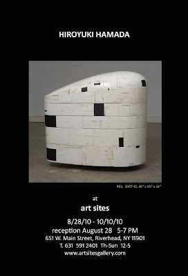
3 New Pieces in the Next show
In News onLast year, my painter friend Darlene Charneco kindly introduced my work to
people at Art Sites, a gallery in Riverhead, NY. They actually liked the work
enough to do a show. And it’s coming up!
The town of Riverhead is located at the northern part of eastern Long Island,
NY. It’s a rather big town for the area with its set of county buildings. It can
also be beautiful with the river going nearby and it’s got an aquarium
(Atlantis Marine World) where I take my kids. The town is not fancy at all like
some of the summer spots in the Hamptons. It’s sort of rustic, can be seedy,
sort of reminds me of towns I’ve seen in Weird NJ. OK, it’s sort of weird and
it’s been making me want to find out more about its curious nature. It’s an
intriguing place where I would want to walk around with my camera. In short,
I like the town.The gallery is run by an architect couple, Glynis Berry and Hideaki Ariizumi,
who converted a Jeep dealer building, basically with their bare hands into
three gallery rooms and their architect office. The ground also includes a
park-like outdoor exhibition area facing the river. It’s very nice. In addition
to their regular gallery schedules, they’ve been opening the space for various
community activities, and this year they had their 2nd annual Peconic River
Festival. And this is not their first gallery space. They have a quite followings
since their Greenport gallery era (Their first gallery space was located in the town
of Greenport where they still reside). They’ve been known in the area to put up
solid shows. It’s really generous of Glynis and Hideaki to let me be part of their
programing. Thank you so much.
Art Site Gallery Plan
I’ve been looking forward to seeing how my work will interact with their rooms
(101, 101 and 102A). Also, I’m excited to show three new works which I’ve been
working on for the past years. One of them (#63) appears in the announcement
above. More images of #63 along with images of #56 and #69 will be added shortly
to the main part of the site. The show will likely include over 10 pieces and I will
post details as we get closer to the opening.Here is an excerpt from Art Sites’ press release:
Hiroyuki Hamada’s works are monumental in impact, but built with delicacy.
They are filled with an unknown spirit. There is no direct reference, but one can
read the mysteries of the ancients or the mapping of a digital age in their rich
surfaces. The forms hold space, rather than make it. Tension pervades, as each
mark and tone tell a story of perfection, balance and upset. Hamada spends up
to three years creating the sculptures, as he applies plaster over burlap and
wooden forms. He then shapes and stains them with wax, resin, and paint.Hamada, at 18, moved from Tokyo to West Virginia, due to his father’s
involvement with the steel industry. Culture shock, language challenges,
and minority status were exacerbated by the parallel shift from an urban
to a rural lifestyle. In college, after starting in psychology, Hamada
became more enamored of art, especially after being exposed to the work
of Karl Jacobson. With a M.F.A. from the University of Maryland,
Hamada’s art transitioned from emotionally generated art, to a
fascination with the abstract, especially the interaction between
lines, colors, tones, and shapes in three dimensions.Hiroyuki Hamada has developed his work with the support of the
Pollock-Krasner Foundation, residencies at the Fine Arts Works
Center, the MacDowell Colony, the Virginia Center for creative
Artists, and the Edward Albee Foundation, and more recently, a
grant from the New York Foundation of the Arts.


