For the past few months, I’ve been working with a print making process called Piezography. It’s a black and white inkjet printing process developed by Jon Cone of ConeEditions Press.
Large format Epson ink jet color printers have 6 to 11 ink heads, depending on the models. They can apply a wide range of colors in addition to black and white tones. The result is generally accepted as superb. But Piezography takes it further by replacing all channels with 7 shades of carbon pigment black ink. This allows the printer to eliminate the need to mimic gray tones by computer generated dot patterns. Instead, the 7 channels of black apply tightly packed pigments onto the media, creating a more organic, more accurate rendition of black and white tones. Also, since the result is basically carbon on paper, it can practically outlast most of anything.
My initial impression is that the Piezography is particularly good at capturing the air or the subtlety of atmospheric expression in pieces. Most of my prints with the graphic contrast have come out very well with the regular Epson printing process, however I’ve felt that there is an obvious limitation in expressing this subtle depth, which is particularly obvious in pieces with lighter negative spaces.
One of the features of Piezography is its emphasis on the accuracy of on-screen digital proofing by insisting on the right tools and settings. And I was hoping that this would make the making process more efficient by reducing the trial and error process of actually printing. But the making process so far has proved that there is just so much I can see on the screen.
In this regard, I learned an interesting fact during John Cone’s Piezography workshop. The screen technology has evolved very much away from the digital print making technology. The latest screen technology, for example, can provide a much wider dynamic range than what we can see on papers. The intensity of the contrast on bright screens and its seductiveness represent a major aspect of our visual culture today, at least on screens. Jon Cone called the entire field of inkjet printing “vintage”. And the gap between the old and new became apparent when we calibrated our screen to show what we actually see on our prints. The dull, flat images on screens were devoid of the tactile, organic presence of the cotton fibers of the papers or the atmospheric subtlety of various shades of black pigments on them. It was interesting to recognize that what we find desirable is very much shaped by the technology provided by the industry.
The same thing has happened in many other fields. For instance, I believe that the lack of the popular appeal for classical music partly stems from the difficulty of reproducing the subtlety of layered instruments and the wider dynamic range required to reproduce the full spectrum of the sounds by our playback systems. It is unfortunate that the tendency persists due to the widely available compressed music file formats and playback systems geared toward those materials, although, technologically speaking, there are great options available for those who choose to appreciate wider varieties of content today.
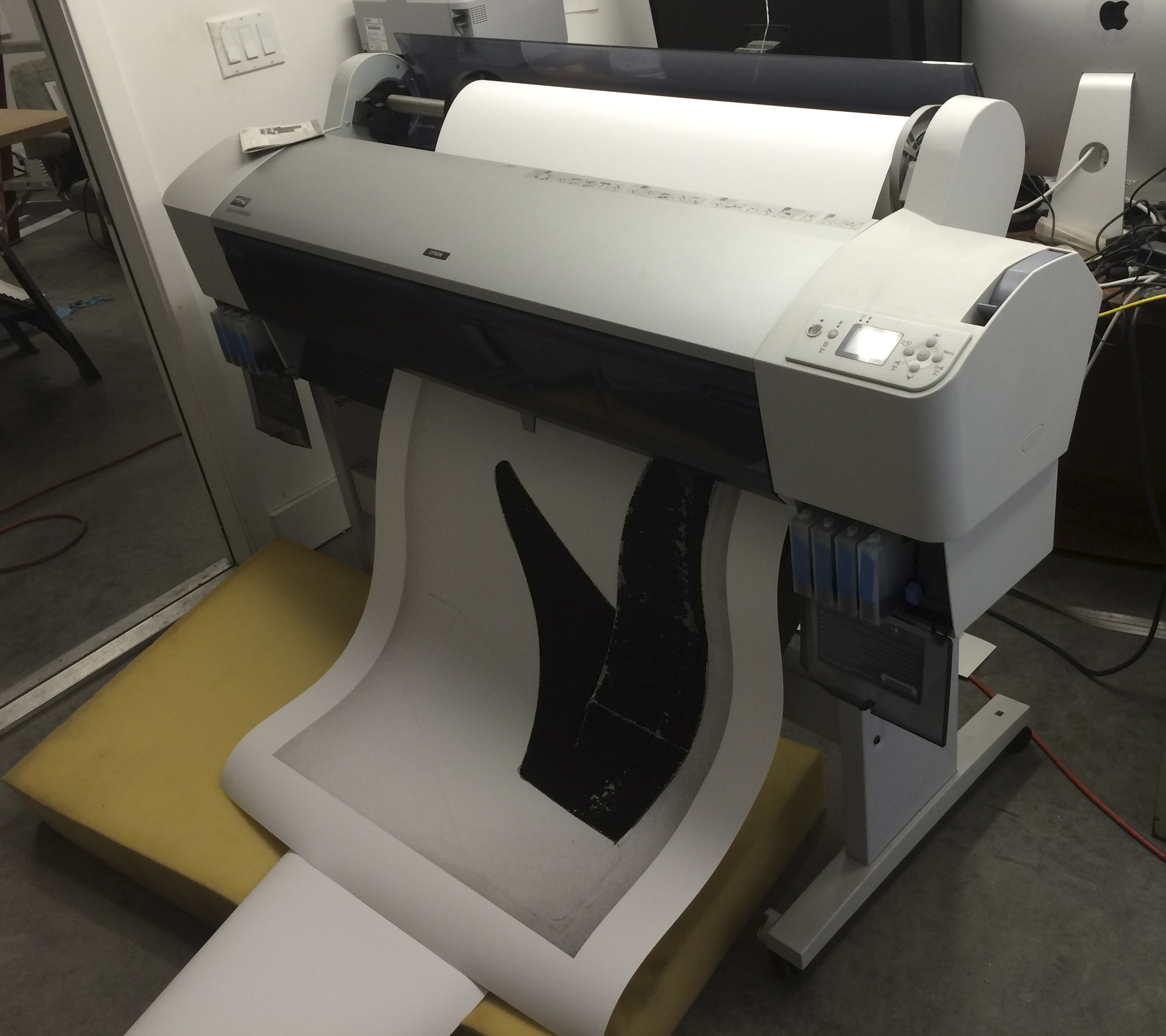
Anyway, I’ve struggled with an image for the past couple of months, and finally, I have an image file.

B14-07, 36″ x 49″
This particular piece will be framed and shipped to Brooklyn.
Please email me if you are interested in the print.
Previous Article
The Recent Paintings will be at Lori Bookstein Fine Arts, NYC
0 Comments
Leave a reply
You must be logged in to post a comment.