-
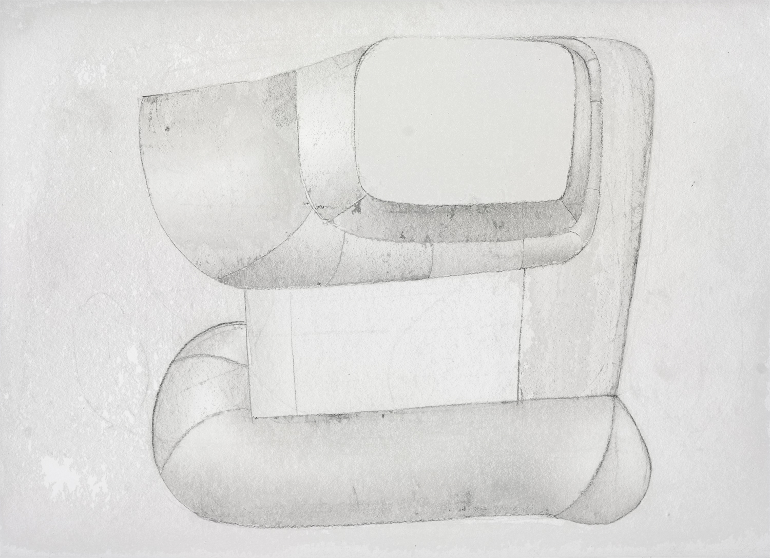
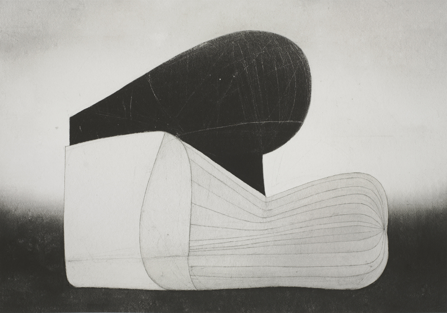
New Print, B18-12
Here is the 7th Piezography print. I’ve struggled quite a bit but I am very happy with how it turned out. The whole struggle with the print project is to express subtlety, gentleness, warmth, tangible mass of black emerging from actual ink hitting the paper as opposed to how we perceive the image on screen. Doing so with a digital software is certainly a challenge that requires more time and trials and errors. It has been very rewarding and educational, and very much humbling as well.
B18-12, size varied, Piezography on cotton rag paper -
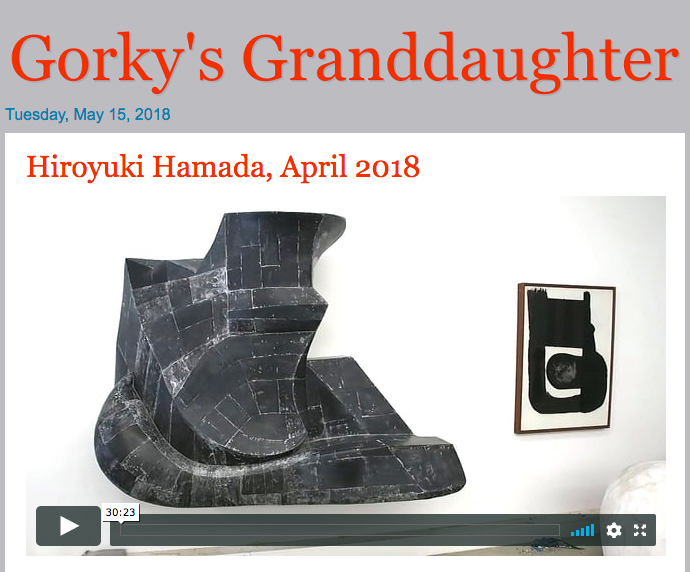
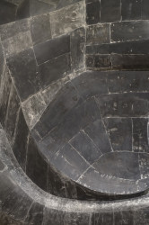
Gorky’s Granddaughter: Hiroyuki Hamada, April 2018
I had a wonderful studio visit by Zachary Keeting and Christopher Joy from Gorky’s Granddaughter a few weeks ago. They captured it nicely for you to see it as well.
-
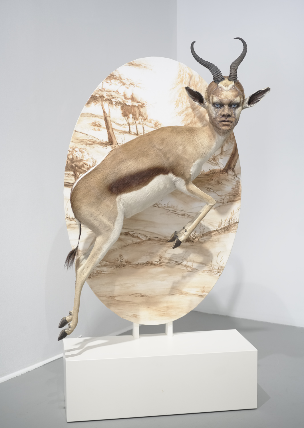
The Visual Thread
Here are some images from The Visual Thread, a group show curated by Lori Bookstein which commemorates the 50th anniversary of the Fine Arts Work Center in Provincetown.
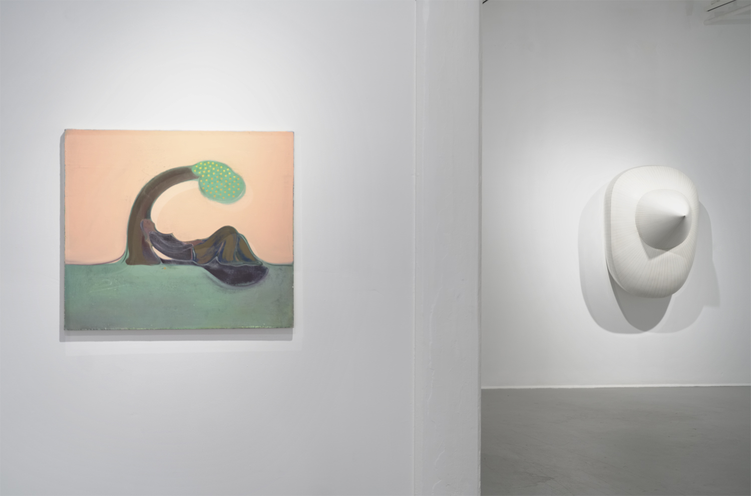
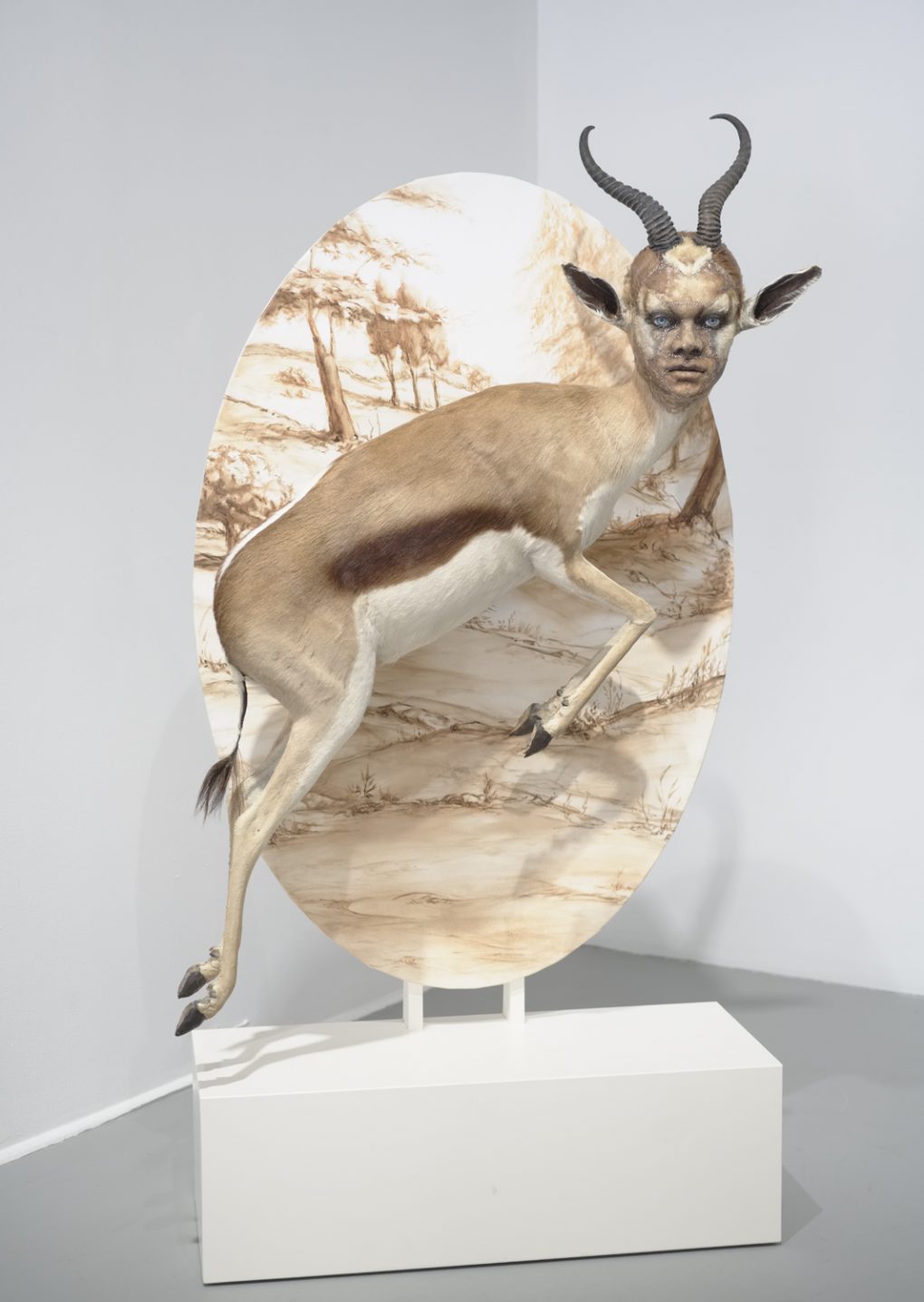
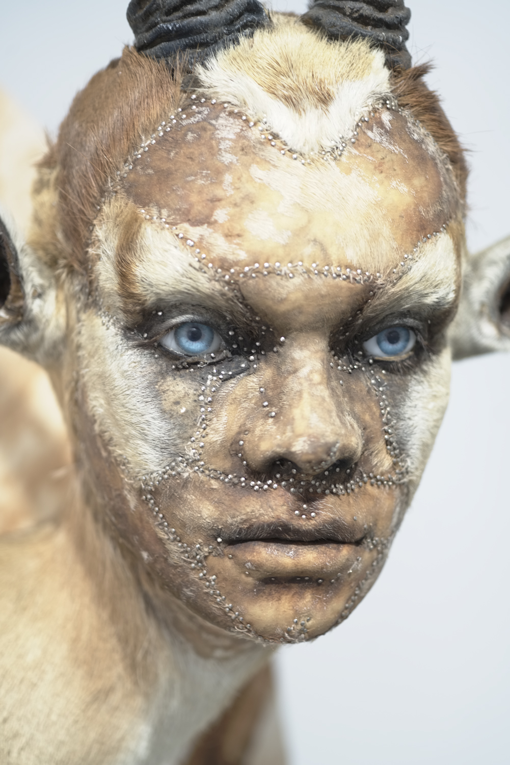
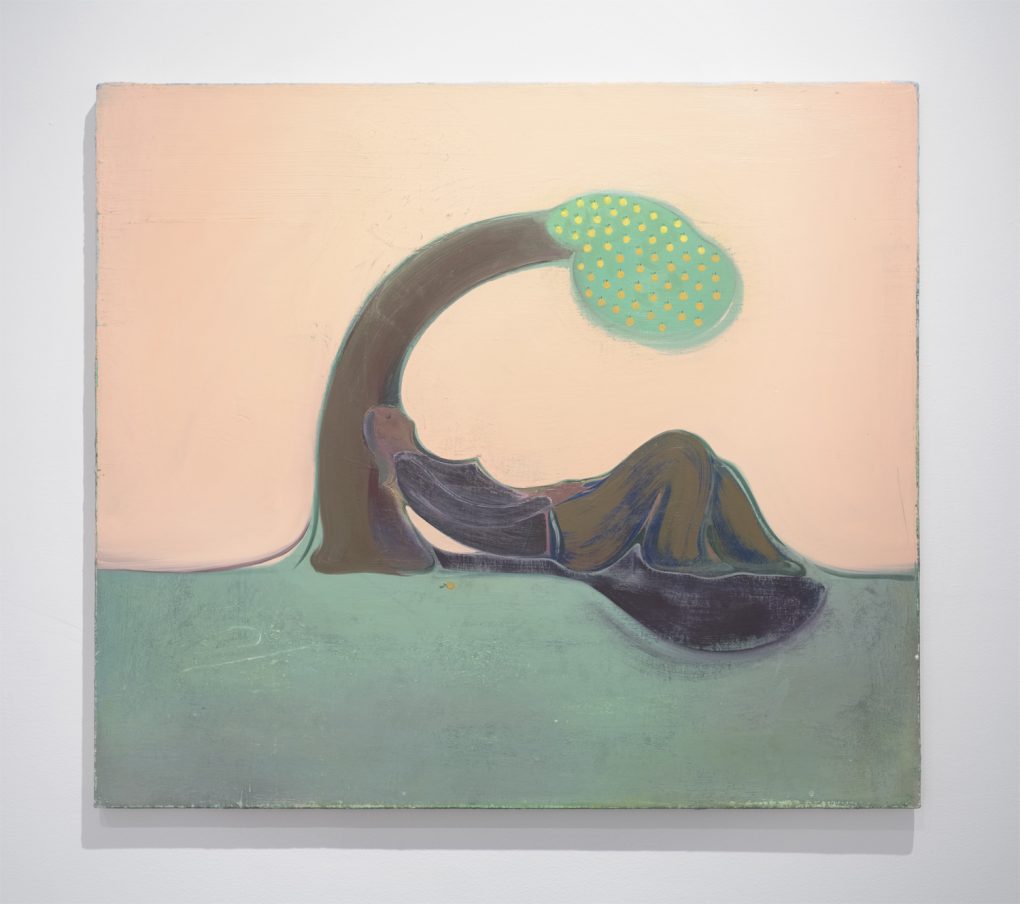
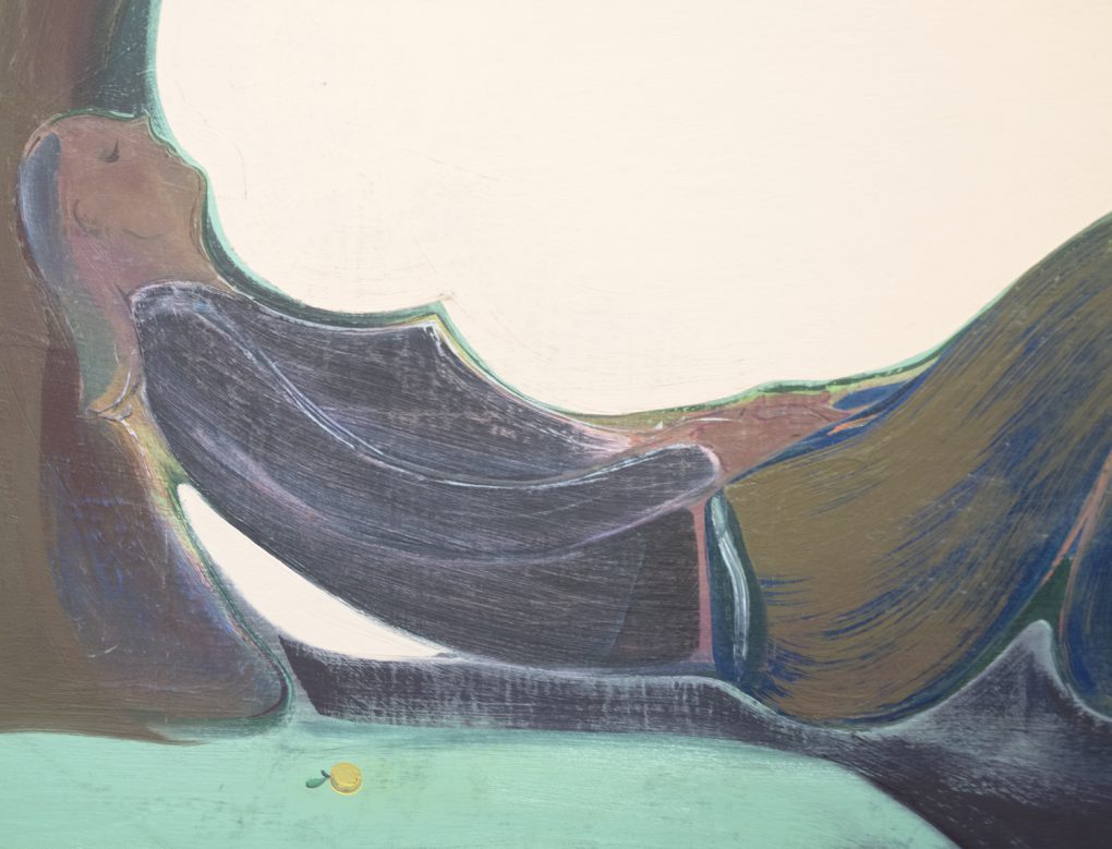
I’m always intrigued by Kate Clark‘s human animal sculptures. And Heidi Hahn is one of my favorite painters. I like how her paintings can be very emotional, yet unmistakably absurd and odd, and all the elements are expressed with a very solid formal visual quality. I am happy to be in the same show with them. My work sits next to Sam Messer’s striking piece titled “how beautiful is the tiger who killed me”.
Well, I can keep talking about other wonderful artists in the show…
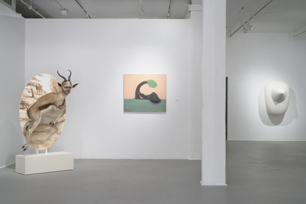
Left: Kate Clark, Charmed, 2015, varied materials, 72 x 40x 23 inches
Center: Heidi Hahn, The Body is Not Essential XII, 2016, oil on canvas, 32 x 36 inches
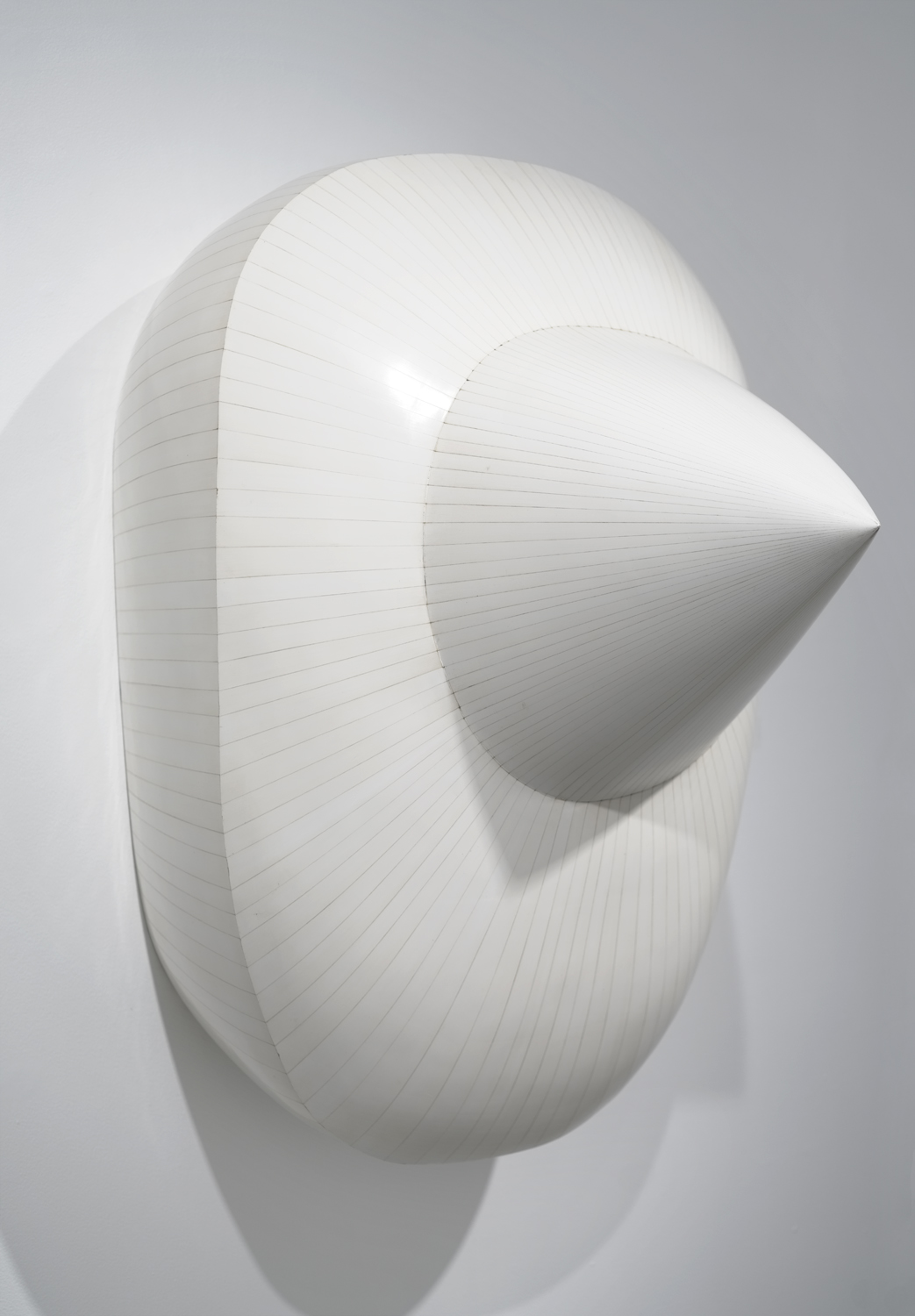
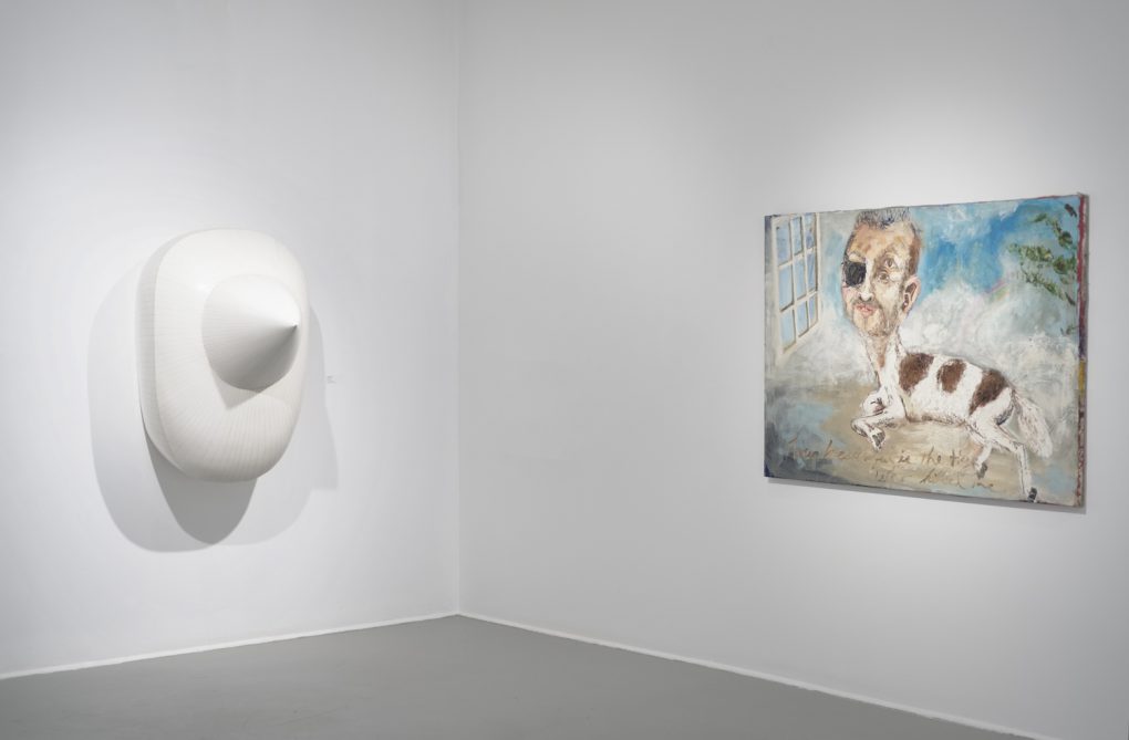
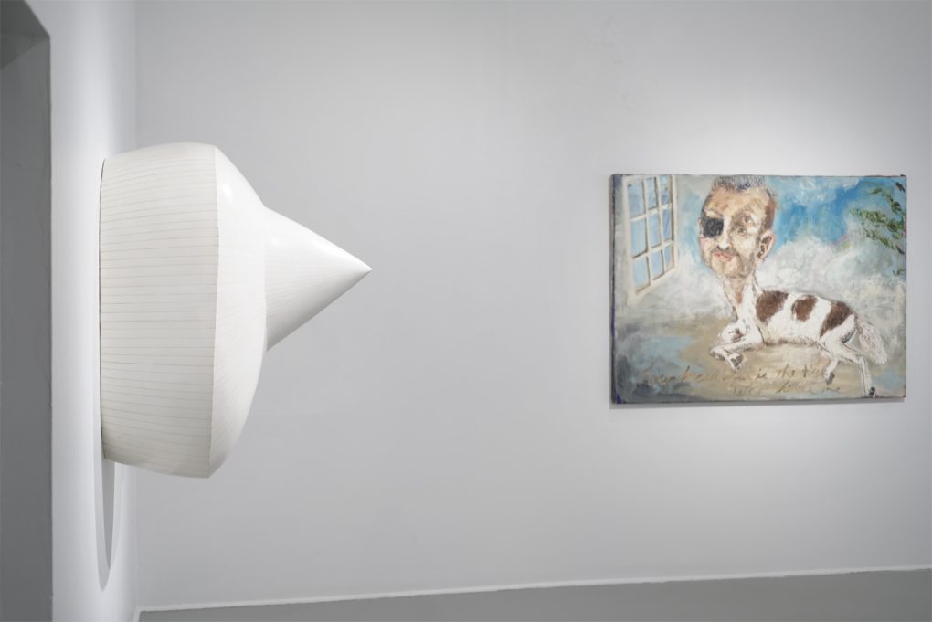
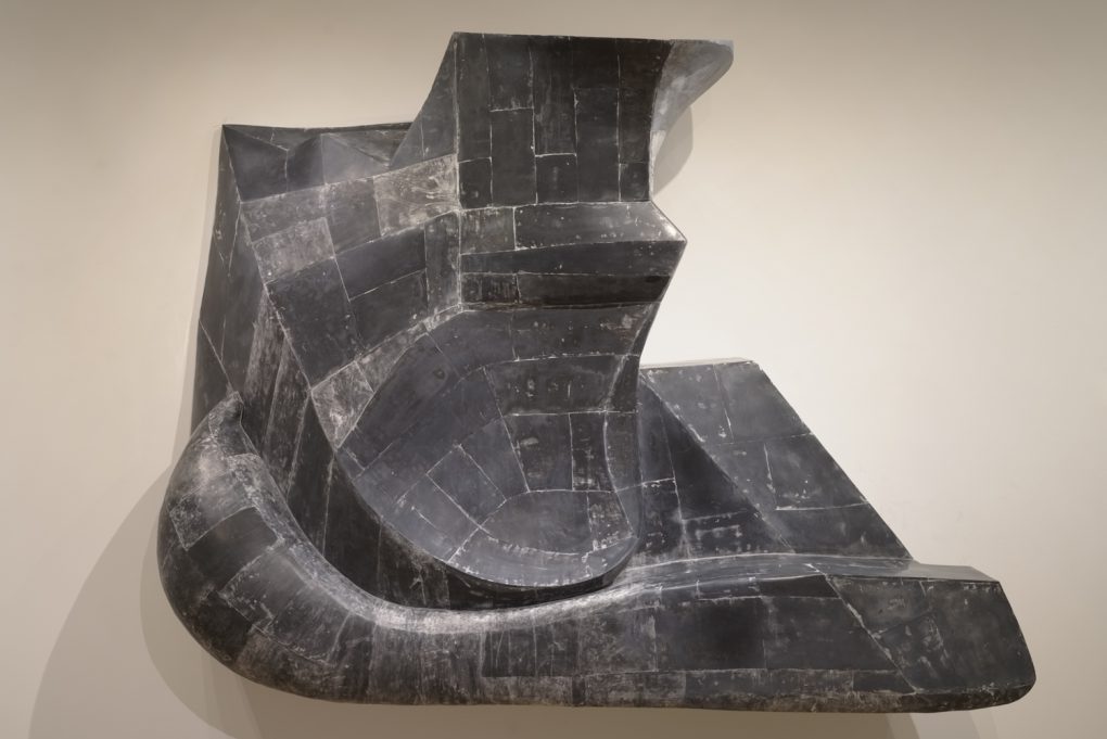
Right: Hiroyuki Hamada, #76, 2011-13, painted resin, 46 x 37 x 31 inches

Left: Hiroyuki Hamada, #76, 2011-13, painted resin, 46 x 37 x 31 inches
Right: Sam Messer, how beautiful is the tiger who killed me, 2017, oil on canvas, 48 x 60 inches
You will probably recognize some of the artists in the show.
#LisaYuskavage#EllenAltfest#RichardBaker#BaileyBobBailey#PaulBowen#MattBollinger#AmyBrener#EllenDriscoll#KateClark#EllenGallagher#HeidiHahn#HiroyukiHamada#SharonHorvath#SamMesser#ElliottHundley#SarahOppenheimer#JenniferPacker#JaniceRedman#JackPierson#JacolbySatterwhite#KahnandSelesnick#DuaneSlick#SableElyseSmith#JamesEverettStanley#TabithaVevers#BertYarboroughYou can see more images here:The show is up till May 20th at Mills Gallery at Boston Center for the Arts.
-
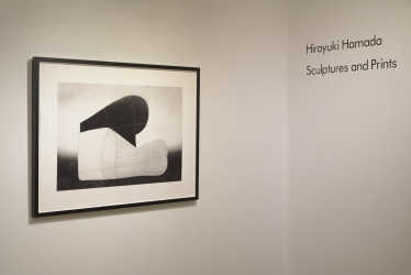
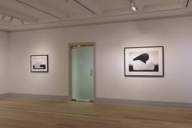
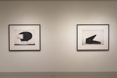
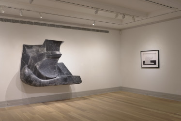
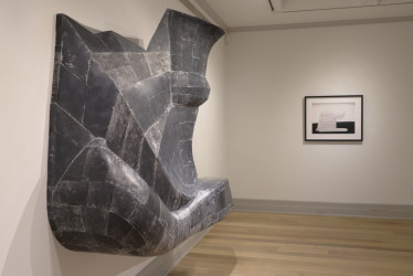
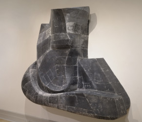
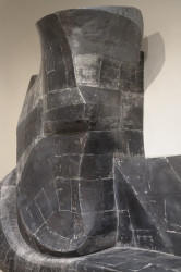
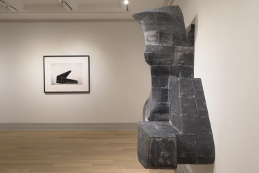
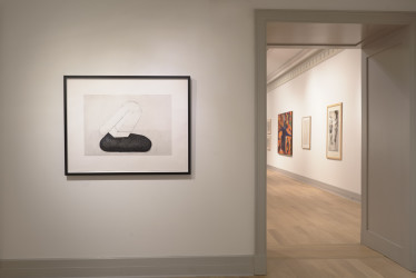
Guild Hall Show Opens Today
I am very happy about how the show turned out. The new piece (pictured below) was safely brought into the museum. It is surrounded by five of my Piezography prints. Scroll down for some images from the show…
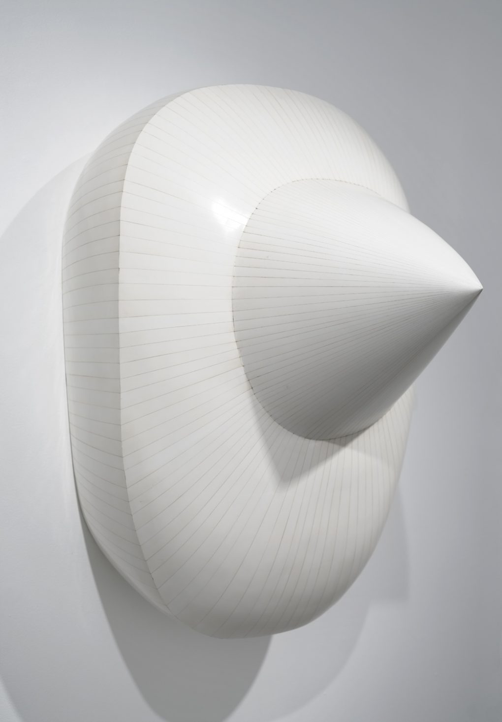
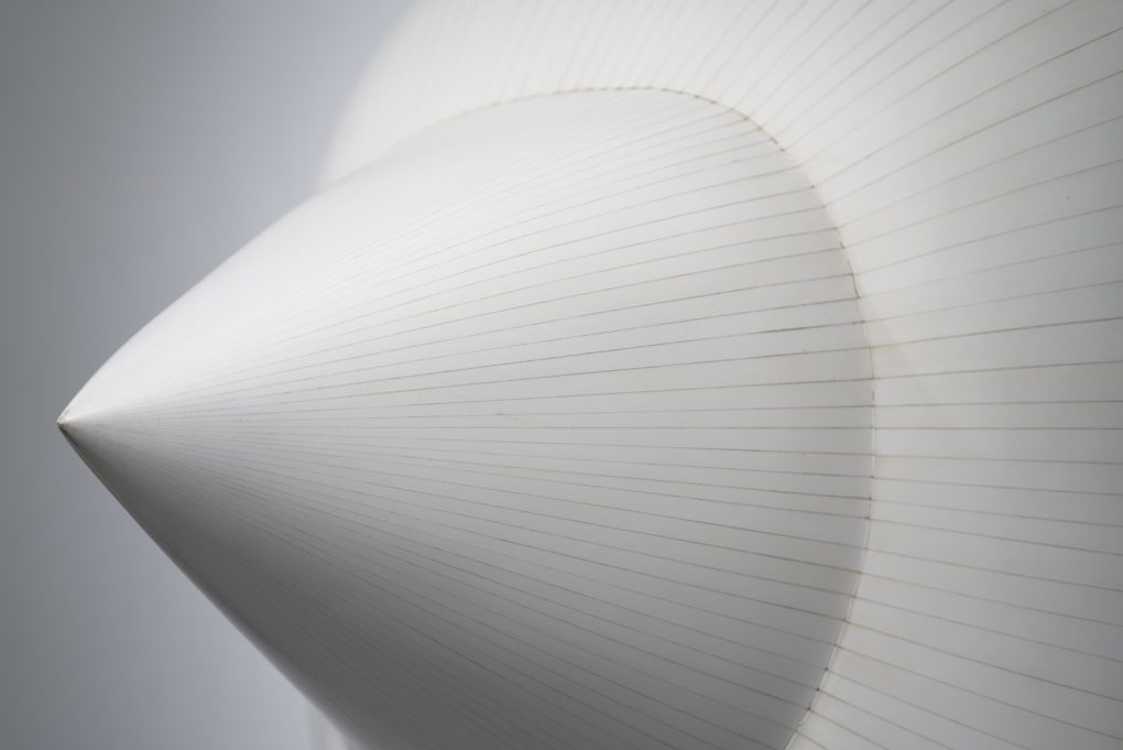
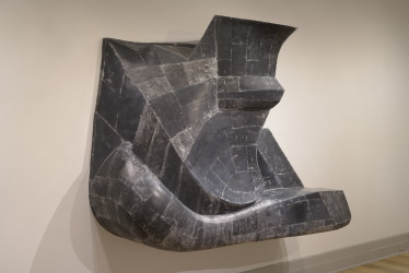
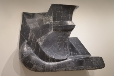
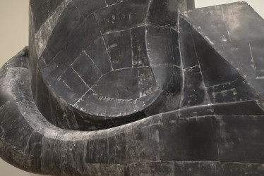
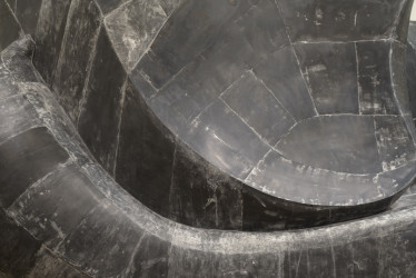
 82, 78 x 61 x 26 inches, pigmented resin, 2017-18
Hiroyuki Hamada: Sculptures and Prints
February 24, 2018 – March 25, 2018
Reception: February 25, 2018, 2:00pm- 4:00pmGallery Talk with Hiroyuki Hamada: March 10, 2018 2:00pm
Guild Hall
Address: 158 Main Street, East Hampton, NY 11937
Phone: 631.324.0806Click to enlarge

-
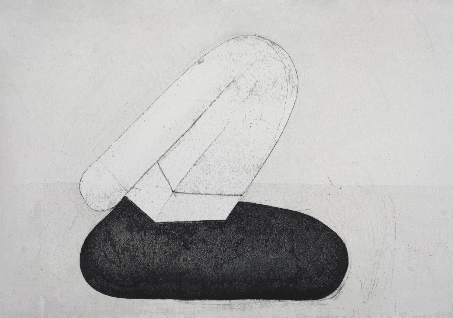
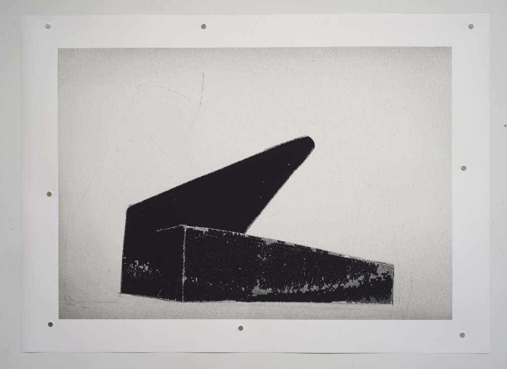
New Print, B17-19
In Print on -
New Print, B17-22
In Print onFinally, here is a second Piezography print.
Making Piezography prints turns out to be much more challenging than I expected. The subtle differences between an image on a screen and an image on paper are quite large when one actually confronts them.
I suppose that the difficulty partially comes from the fact that the images are already done on screen. There is a step of translating in printing them. As I already mentioned, our computer screen generally has a much wider range of dark and light, but on paper we have a tactile subtlety that can’t be matched with an image on screen, at least not today. The Piezography printer setup simply has the capability to print with higher resolution than what we see on screen. Also there must be some fundamental differences in perceiving an image with an artificial light source behind the screen and an actual object reflecting a natural light source.
As we are all aware, the visual experience on the web truncates part of our perception and renders it somewhat different than the actual experience. But I guess that’s a topic that should be discussed separately.
Jon Cone, the developer of Piezography, provides a preview setting for Photoshop which mimics how the image will appear on paper. The setting is quite useful in the process and I will certainly use it for making new images.
I can describe the general difference between screen and paper but simply translating it mechanically just doesn’t work as you’d imagine. It’s like playing the same song with different instruments perhaps. I want to fully utilize the timbre of the printing method. And since I am the one who came up with the visual narrative, naturally, I feel the liberty of turning the process into a whole new making process.
Anyway, I’m very happy with the print. Hope you like it too.
-
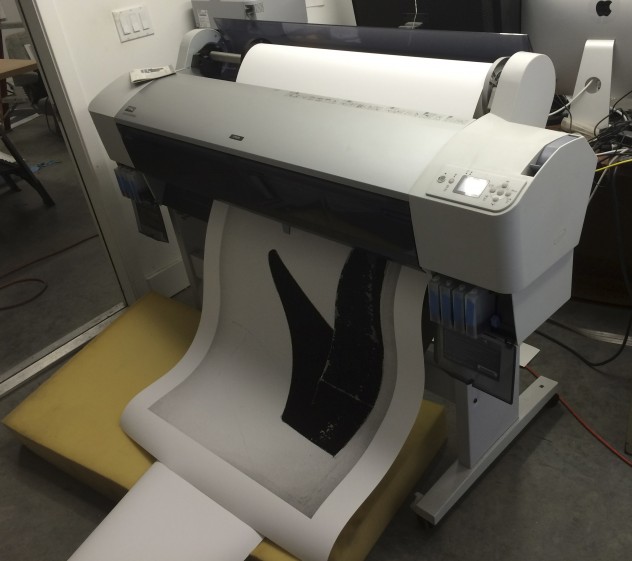
Print Update
For the past few months, I’ve been working with a print making process called Piezography. It’s a black and white inkjet printing process developed by Jon Cone of ConeEditions Press.
Large format Epson ink jet color printers have 6 to 11 ink heads, depending on the models. They can apply a wide range of colors in addition to black and white tones. The result is generally accepted as superb. But Piezography takes it further by replacing all channels with 7 shades of carbon pigment black ink. This allows the printer to eliminate the need to mimic gray tones by computer generated dot patterns. Instead, the 7 channels of black apply tightly packed pigments onto the media, creating a more organic, more accurate rendition of black and white tones. Also, since the result is basically carbon on paper, it can practically outlast most of anything.
My initial impression is that the Piezography is particularly good at capturing the air or the subtlety of atmospheric expression in pieces. Most of my prints with the graphic contrast have come out very well with the regular Epson printing process, however I’ve felt that there is an obvious limitation in expressing this subtle depth, which is particularly obvious in pieces with lighter negative spaces.
One of the features of Piezography is its emphasis on the accuracy of on-screen digital proofing by insisting on the right tools and settings. And I was hoping that this would make the making process more efficient by reducing the trial and error process of actually printing. But the making process so far has proved that there is just so much I can see on the screen.
In this regard, I learned an interesting fact during John Cone’s Piezography workshop. The screen technology has evolved very much away from the digital print making technology. The latest screen technology, for example, can provide a much wider dynamic range than what we can see on papers. The intensity of the contrast on bright screens and its seductiveness represent a major aspect of our visual culture today, at least on screens. Jon Cone called the entire field of inkjet printing “vintage”. And the gap between the old and new became apparent when we calibrated our screen to show what we actually see on our prints. The dull, flat images on screens were devoid of the tactile, organic presence of the cotton fibers of the papers or the atmospheric subtlety of various shades of black pigments on them. It was interesting to recognize that what we find desirable is very much shaped by the technology provided by the industry.
The same thing has happened in many other fields. For instance, I believe that the lack of the popular appeal for classical music partly stems from the difficulty of reproducing the subtlety of layered instruments and the wider dynamic range required to reproduce the full spectrum of the sounds by our playback systems. It is unfortunate that the tendency persists due to the widely available compressed music file formats and playback systems geared toward those materials, although, technologically speaking, there are great options available for those who choose to appreciate wider varieties of content today.
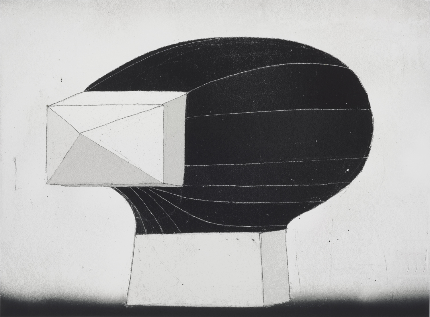
Anyway, I’ve struggled with an image for the past couple of months, and finally, I have an image file.
B14-07, 36″ x 49″
This particular piece will be framed and shipped to Brooklyn.
Please email me if you are interested in the print.
0